Showing posts with label Paint Colors. Show all posts

California Wine Country Color & Design Project


Benjamin Moore White Dove Cabinets

Another fun project with my fave California clients - a complete renovation of their new vacation home in Paso Robles Wine Country.

New everything!

Paso Robles is a unique wine region halfway between Los Angeles & San Francisco along California's Central Coast.  


Benjamin Moore Van Cortland Blue Island
Benjamin Moore White Dove Perimeter
Benjamin Moore Swiss Coffee Walls
Hickory Wood Floors


With it's a spicy and soulful vibe, Paso Robles has a beautiful mix of design styles.

And nature astounds with big day-to-night temperature swings, earthy landscapes with coastal influences, and a diverse mix of rich, unique soils.


Benjamin Moore Swiss Coffee Walls

Paso has a bold spirit.   A bricolage of personalities.   I remember standing at an old stone fireplace in a winery, staring at a group of cowboys sipping wine.    Hats, spur boots, leather,  mixed with denim and fine wine, overlooking green vineyards with the bluest sky.    Need I say more.


Benjamin Moore Swiss Coffee Walls

Below you can see a close up of the countertop -   Caesarstone White Attica is a quartz with a tad of edginess that looks great with a modern dark gray backsplash.


Caesarstone White Attica Countertop
Custom Designed Cherry Hood

And below is close up of the tile.   Many think it's a glass tile.  But no, it's a ceramic high gloss subway tile with a beautiful sheen.


 Ceramic Subway Tile Backsplash

The interior stair railing is designed in a modern style - black metal with wood.   It was originally a half wall, but we wanted to open up the stairway and make everything feel more connected and spacious.

Benjamin Moore Swiss Coffee Walls

The Powder Room was a real challenge due to a corner toilet that could not be moved.  Quite frankly, it was a dreadful space.  But no mission is impossible,  and I am proud to brag that I transformed that quirky space into a stunning powder room that everyone now loves.


Corner Toilet Bathroom 

Below is the renovated master bathroom - you can really appreciate the new hickory floors  that run throughout most of the home in below photo.   And of course the home needed a barn door!


Barn Door at Master Bath

Selected a dark, almost black floor tile.  I am a fan of dark floors in bathrooms to ground and warm up the space, and provide a contrasting pop.   And it really brings out the beauty of the adjoining wood floor.

Master Bath
Walls - Benjamin Moore Silver Marlin

Notice nature's gorgeous  Eucalyptus Trees outside the window!  Serene & magical.


Benjamin Moore Silver Marlin Walls

Below is a photo of one of the guest bedrooms that shows off the exterior views.    


Benjamin Moore Swiss Coffee - Walls

Adjoining Guest Bathroom below.

Benjamin Moore Silver Satin Walls

Hallway Guest Bathroom.  Yep - live, laugh, love print.


Definitely a fun color & design project with one of my favorite clients.  And I adored visiting the vineyards!

The project is not completely finished, we are working on the last phase now.  And will be sure to update when completed.


SoNo Corporate Color & Design Consult

Conference / Training Center

Honored to be the Color & Design consultant on this spectacular project.

Program - to create a high end corporate amenity space including lounge area, game room, fitness club, and conference / training center.

Concept - to create a sophisticated industrial warm modern space, with a nod to it's historical district roots.


Lounge Area Game Room 

Lounge Area & Game Room

Lounge Area  

Game Room 

Fitness Club Locker Room  

Fitness Club
Fitness Club

Absolutely thrilled with the bold beauty of the space.    Ahh, once again the power of color & design rocks.


California Coast Color & Design


It's always a delight  to color and  design in beautiful southern California.  

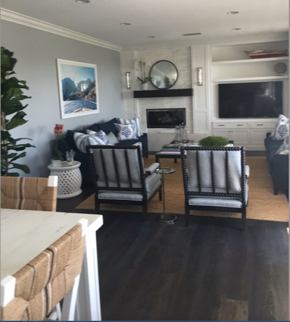
Goal was to create a modern version of this water view home, while honoring the existing old world architecture.   

The entire design project was done via a virtual consultation, including space planning, design, fixed finishers, furnishings, and wall art.

My client was an absolute pleasure to work with.  And her professional contractor skillfully transformed my sketches into reality.   

The design process went smooth, communication was great, and everyone was thrilled with the result.   


Benjamin Moore Eternity AF-695 Walls
Benjamin Moore Chantilly Lace OC-65 Trim


The existing kitchen cabinets were in excellent condition, so we kept mosts, modified the rest, added high crown molding over the permanent soffit, extended island to create eating area, and designed a quintessential window seat.

All cabinets and trim were painted Benjamin Moore Chantilly Lace.   New white backsplash tile was installed to ceiling.   New honed Carrara marble countertops added authentic beauty.

A retro fit farm sink was installed, hardware replaced with polished nickel, and a new dark wood floor, all added to the transformation.   


Cabinets Benjamin Moore Chantilly Lace

The second stage of the Great room was the family room renovation.    Mission to update fireplace wall, and all new furnishings and decor.  


Walls Benjamin Moore Eternity AF-695


The existing raised heath could not be removed.  And keeping it reinforced old world architecture into a m modern transition.  


Woodwork Benjamin Moore Chantilly Lace OC-65


Thrilled my client liked the classic modern Gray Malin photography - a perfect nod to our sophisticated coastal theme.   


Walls Benjamin Moore Eternity AF-695

We continued the Benjamin Moore Chantilly Lace woodwork throughout the home, but lightened the wall color to Benjamin Moore Stonington Gray in the rest of the home.


Walls Benjamin Moore Stonington Gray HC-170
Woodwork Benjamin Moore Chantilly Lace OC-65

 
Another successful project was accomplished thru great teamwork, and the power of color and design to complete transform a space into a meaningful and beautiful home.  

Modern Rustic Mountain Home with Benjamin Moore Paint Gray Horizon 2141-50

Benjamin Moore Horizon Gray 2141-50 Wall Paint


Loved working on this major Color & Design renovation project for a mountain vacation home with one of my favorite clients in Mammoth Mountains California.


Benjamin Moore Horizon Gray 2141-50 Wall Paint


Mission was to create a warm mountain feel with a modern sensibility.

So, we blended rustic finishes with modern elements and achieved an updated ambiance honoring the natural environment.  


Benjamin Moore Horizon Gray 2141-50 Wall Paint


The kitchen design combines shaker cabinets with a modern quartz countertop.

The white quartz slab backsplash not only brightens the kitchen area but adds a serene calmness to the walls and visually breaks up the wood surfaces.  


Benjamin Moore Horizon Gray 2141-50 Wall Paint


The paint color throughout most of the home is Benjamin Moore Horizon Gray 2141-50.  

Horizon gray is a nod to nature and has enough oomph to hold its own with the heavy finishes and mountain views.   Yet the color is light enough to keep the walls fresh and cheerful.

And Horizon Gray works well as a backdrop for art and wall decor.


Benjamin Moore Horizon Gray 2141-50 Wall Paint


As usual, texture is essential to create interest and warmth in natural environments.    Even the modern light adds texture with its linear rhythm.  


Benjamin Moore Horizon Gray 2141-50 Wall Paint


And I love to add pops of white to emphasize a fresh modern vibe.  Shouldn't every vacation home bathroom have a spa personality!

Wow.   Wish this was my mountain home.  But I'm blessed to add this Color and Design project to my repertoire.

My passion to help create beautiful and meaningful spaces is boundless.  If you need a color and design consultation, do not hesitate to contact me.


Benjamin Moore 2019 Color of the Year Metropolitan AF-690

Benjamin Moore Color of the Year 2019
METROPOLITAN AF-690


The day before Benjamin Moore released their 2019 Color of the Year, I pondered with excitement.

Funny, my wild guess was a neutral like Balboa Mist or Cumulus Cloud.   With all the saturated color in the design world today, a neutral wall color is often optimal.  Especially if you want to add lots of personality through wall art or wall decor.

I've been specifying mostly neutral wall paint colors for a while now.  Neutrals act as a wonderful foil for color through art, furnishings, and accessories.

So I was thrilled when Benjamin Moore chose a gray for 2019 with Metropolitan.

(And Balboa Mist made the cut for the other fourteen 2019 trend colors!)

Metropolitan is a sophisticated gray.  Leans towards green, but color is all about context and lighting. I've seen paint color do crazy, unexpected things, lol.  Always test the color before committing.

What I love about Metropolitan is how it sets the stage for a visual performance.  And how versatile it is.

Metropolitan has enough substance and integrity to hold its own in visual weight.  Can add lots of white & black with pops of bright or bold colors for an edgy, modern vibe.

And Metropolitan is a gray that looks great with woods, and other neutrals for a classic and timeless style.

Or a rustic farmhouse look with tons of texture and contrast.

Yet Metropolitan is quiet enough to feel serene with lighter and softer palettes for a harmonious or spa-like ambiance.

With Metropolitan, if I may use the phrase, the world is your oyster.


Benjamin Moore Balboa Mist & Cloud Cover Beach House

White Kitchen Cabinets, White Marble Counter, Gray Glass Backsplash


This spec project was a major renovation to update a rather large and charming old home by the beach.   The owners called me to consult on the fixed finishes, materials, and colors in the home.

White kitchens are always fabulous - clean, crisp and airy.   The dark floors ground the old home into the earth, while the light colors provide a spacious and modern atmosphere.

White marble countertops are as modern as they are historical.  And there is something about polished marble that makes the light bounce throughout the room.

I'm a big fan of stainless steel appliances as they provide even more bling and reflection.

And the glass tile backsplash shines as well, as the medium gray color provides a balance between the white cabinets and dark floors.


Walls Benjamin Moore Paint Color Balboa Mist OC-27 and 1549


The adjacent dining room is painted a soft, warm, light gray - Benjamin Moore Balboa Mist.


Walls Benjamin Moore Cloud Cover  OC-25


The first floor office is a wonderful example of the power of contrast between the dark floors, light walls and white trim.

All the wood floors throughout the home is stained a rich and deep ebony.

Walls - Benjamin Moore Cloud Cover OC-25


The photo above is the seating area of the master bedroom suite.  Once again painted a modern and sultry off white called Cloud Cover by Benjamin Moore. 

And below is the lovely quaint porch area off the master bedroom.   I love how the ceiling slopes and gently meets the windows, as the view of the water is shortly beyond.


Now if this was my home you would find me every morning on this porch, with the windows wide open!

A beach house.  Sigh.  What a beautiful way to start the day breathing in that fresh salty air.   And I imagine this porch would be a special sanctuary for creative and dreamy thoughts.


Benjamin Moore Spanish Olive & Queen Anne PInk Color Consultation

Benjamin Moore SPANISH OLIVE 1509 Wall


Sometimes a mellow, but sultry neutral, is the perfect paint color selection for an old home, where the architecture and furnishings take center stage.

This beautiful Spanish Mediterranean home is located in the Los Angeles suburbs and reeks of old world charm and historical character.   Every nook and corner has a story to tell.

We chose Benjamin Moore Spanish Olive 1509 for the wall paint color.  It's a gray-green or green-gray, depending on context, and the mood of the day.   Spanish Olive reads as a neutral, with just the right amount of depth to hold its own to the heavy architecture.

Notice how the walls allow the colorful vintage posters to sing.  And dance.  As the wall color creates a foil for the art, without competing with it.

Benjamin Moore Spanish Olive 1509


And when your choose a meaningful paint color for a space, it creates an experience.    Once again, mission accomplished.

Makes me want to grab one of those books, snuggle up in that chair, and get lost in story land.  Oh, and perhaps sip a martini, with extra olives.

But first lets continue this color chat - and move on to the next room - the Sun Porch.    Beyond excited my clients liked my Queen Anne Pink suggestion.

Benjamin Moore QUEEN ANNE PINK HC-60 Walls


Queen Anne Pink is in the Benjamin Moore Historical Collection # HC-60.    Its a sophisticated and adult pink that leans towards a peach.   And I am just crazy about Queen Anne Pink.

Benjamin Moore Queen Anne Pink HC-60


A peachy pink - simply heaven.


Benjamin Moore Conventry Gray HC-169 & Storm AF-700

Serenity.

Grays with blue undertones are so calming.  As is Coventry Gray by Benjamin Moore that I specified out for this paint color consult in Harrison New York.

Benjamin Moore Coventry Gray HC-169

My client loves grays, and we viewed many and selected several grays for the entire house.

Coventry Gray by Benjamin Moore graces the living room.

Benjamin Moore Coventry Gray HC-169

And below is a photo of the Dining Room painted Benjamin Moore Storm AF-700.

 Its a darker color than Coventry Gray,  and feels more serious.  Perfect for the formal dining room.

Benjamin Moore Storm AF-700

Storm is a beautiful, medium range, basic gray;  and it feels a bit stormy and moody, but in a good way, a pensive way.  

And all grays look good with lots of white trim and woodwork.  White brings out the beauty in grays. 

If you need help picking out grays or any other color, do not hesitate to contact me for a consultation, on site or virtual.    We will go step by step in the fun process, and find a color that goes lovely in the space, and a color you love, that has meaning to you.

Always my pleasure to help color the world.


White Kitchen Cabinets - Stained Glass Tile Backsplash - BlueStar Range

Got to love the BlueStar ranges - they come in over 750 colors.  Yes I said 750.  Amazing.

This project involved selecting a backsplash for a Kitchen Showroom display that would bring together the white painted cabinets, the BlueStar range, and the Black Absolute polished granite.

White Painted Cabinets
Stained Glass  Mosaic Tiles
Black Absolute Granite
BlueStar Range

The tile chosen is Vihara Glass 1x4 Mosaic, a stained glass multi colored tile.   Its stunning in person.

Just love the bold blue color of the range -  which was my inspiration for the backsplash.  But it is such a bold color, that I needed to find a calmer tile, with a tinge of the bold blue in it.  

Below is a close up of the beautiful tile.

Vihara Glass 1x4 Mosaic Blue & Green Stained Glass Backsplash

And this Vihara glass tile was the perfect solution, with just a hint of that bold blue, but enough to relate, and bring it all together as a composition.


Benjamin Moore Bedroom Paint Color Consultation

Sharing an assortment of fun and vivid bedroom paint colors I specified out for several projects.   Some of the photos are still at construction stage, but the colors shine.  

All are Benjamin Moore paint colors and the names & numbers are captioned below each photo.


Benjamin Moore SOFT JAZZ 809


Benjamin Moore GEORGIAN GREEN HC-115


Benjamin Moore PINK PEARL 2005-60


Benjamin Moore POWELL BUFF  HC-35
TRANQUILITY AF-490 (back bedroom)


Benjamin Moore PALISADES PARK 439


Benjamin Moore FRENCH LILAC 1403


Hope you enjoyed he rainbow of colorful paint colors for bedrooms.   If you need any help selecting paint colors, do not hesitate to contact me.