Showing posts with label Color Your World. Show all posts

SoNo Corporate Color & Design Consult

Conference / Training Center

Honored to be the Color & Design consultant on this spectacular project.

Program - to create a high end corporate amenity space including lounge area, game room, fitness club, and conference / training center.

Concept - to create a sophisticated industrial warm modern space, with a nod to it's historical district roots.


Lounge Area Game Room 

Lounge Area & Game Room

Lounge Area  

Game Room 

Fitness Club Locker Room  

Fitness Club
Fitness Club

Absolutely thrilled with the bold beauty of the space.    Ahh, once again the power of color & design rocks.


California Coast Color & Design


It's always a delight  to color and  design in beautiful southern California.  

Goal was to create a modern version of this water view home, while honoring the existing old world architecture.   

The entire design project was done via a virtual consultation, including space planning, design, fixed finishers, furnishings, and wall art.

My client was an absolute pleasure to work with.  And her professional contractor skillfully transformed my sketches into reality.   

The design process went smooth, communication was great, and everyone was thrilled with the result.   


Benjamin Moore Eternity AF-695 Walls
Benjamin Moore Chantilly Lace OC-65 Trim


The existing kitchen cabinets were in excellent condition, so we kept mosts, modified the rest, added high crown molding over the permanent soffit, extended island to create eating area, and designed a quintessential window seat.

All cabinets and trim were painted Benjamin Moore Chantilly Lace.   New white backsplash tile was installed to ceiling.   New honed Carrara marble countertops added authentic beauty.

A retro fit farm sink was installed, hardware replaced with polished nickel, and a new dark wood floor, all added to the transformation.   


Cabinets Benjamin Moore Chantilly Lace

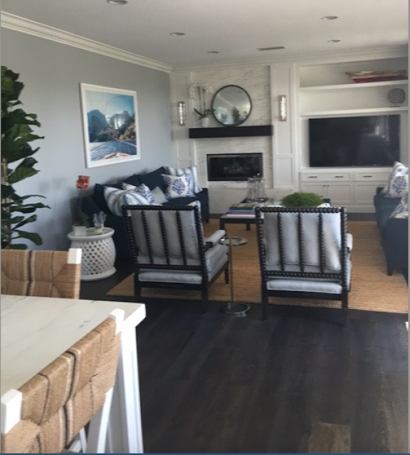
The second stage of the Great room was the family room renovation.    Mission to update fireplace wall, and all new furnishings and decor.  


Walls Benjamin Moore Eternity AF-695


The existing raised heath could not be removed.  And keeping it reinforced old world architecture into a m modern transition.  


Woodwork Benjamin Moore Chantilly Lace OC-65


Thrilled my client liked the classic modern Gray Malin photography - a perfect nod to our sophisticated coastal theme.   


Walls Benjamin Moore Eternity AF-695

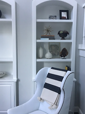
We continued the Benjamin Moore Chantilly Lace woodwork throughout the home, but lightened the wall color to Benjamin Moore Stonington Gray in the rest of the home.


Walls Benjamin Moore Stonington Gray HC-170
Woodwork Benjamin Moore Chantilly Lace OC-65

 
Another successful project was accomplished thru great teamwork, and the power of color and design to complete transform a space into a meaningful and beautiful home.  

Benjamin Moore 2019 Color of the Year Metropolitan AF-690

Benjamin Moore Color of the Year 2019
METROPOLITAN AF-690


The day before Benjamin Moore released their 2019 Color of the Year, I pondered with excitement.

Funny, my wild guess was a neutral like Balboa Mist or Cumulus Cloud.   With all the saturated color in the design world today, a neutral wall color is often optimal.  Especially if you want to add lots of personality through wall art or wall decor.

I've been specifying mostly neutral wall paint colors for a while now.  Neutrals act as a wonderful foil for color through art, furnishings, and accessories.

So I was thrilled when Benjamin Moore chose a gray for 2019 with Metropolitan.

(And Balboa Mist made the cut for the other fourteen 2019 trend colors!)

Metropolitan is a sophisticated gray.  Leans towards green, but color is all about context and lighting. I've seen paint color do crazy, unexpected things, lol.  Always test the color before committing.

What I love about Metropolitan is how it sets the stage for a visual performance.  And how versatile it is.

Metropolitan has enough substance and integrity to hold its own in visual weight.  Can add lots of white & black with pops of bright or bold colors for an edgy, modern vibe.

And Metropolitan is a gray that looks great with woods, and other neutrals for a classic and timeless style.

Or a rustic farmhouse look with tons of texture and contrast.

Yet Metropolitan is quiet enough to feel serene with lighter and softer palettes for a harmonious or spa-like ambiance.

With Metropolitan, if I may use the phrase, the world is your oyster.


HONEYSUCKLE (Color of the Year) is FLIRTATIOUS

A personal mantra of mine is "FLIRT WITH LIFE, ALL OF IT".   It's my philosophy, my mission, my religion.

So when Pantone, a leading color forecaster, recently announced HONEYSUCKLE is their 2011 Color of the Year, I celebrated.

HONEYSUCKLE makes me smile and feel vivacious.  It's naturally a flirtatious color!
Playful. Delightful.

There is something whimsical about it;  a nice balance of sophistication and fun.


Here is what Leatrice Eiserman, Executive Director of Pantone, has to say about the color HONEYSUCKLE:
A Color For All Seasons
Courageous. Confident. Vital.   
A brave new color, for a brave new world.  
Let the bold spirit of Honeysuckle infuse you, lift you and carry you through the year.  
It's a color for everyday- with nothing "everyday about it.

I couldn't agree more.  Here are some wonderful examples I have found:


from Fritz Hansen at Karkula


Betty Murdock Interiors from Traditional Home


by Jonathan Berger (House Beautiful)


Laufen Bathroom


So don't hesitate to color your world with HONEYSUCKLE hues.  You can control its powerful effect by the amount used, the value variations, and the color combinations.  In general, whites, creams, beiges, and grays will calm in down, while oranges, reds, and blacks will excite it even more.   Hot pink speaks loudly (beware it can scream at you), while light pink whispers softly.  The possibilities are endless.

I have a feeling, that 2011 is going to be a very good year!  We are off to a good start with HONEYSUCKLE.

Thank you Pantone.

The Art of Seeing


The first step on the journey to coloring your world is to master the art of seeing.

Although we often look at things, we don't always see them.

Our lives are distracted by thinking about yesterday or tomorrow, and we miss a slice of life.
Don't just wake up and smell the coffee! Experience it. Delight in the visual ritual of drinking coffee. There is a reason why coffee is comforting and makes us feel at home. The rich deep browns of nature give us a sense of belonging and remind us of where we came from.

Ever notice how gracefully cream blends into coffee to create a new earthy color? Color theory in action! Realize how "alive" color is. More or less cream changes the taste, as well as the color. Be part of it. Live in the moment.

That is the art of seeing.

So open your eyes and notice your surroundings. Up, down, and all around. Or you will miss a colorful encounter.

A few weeks ago, I was jogging and glanced up at the sky. I stopped in awe when I saw the most spectacular cloud formations in the bluest sky ever. I was mesmerized not only by natures beauty, but by the intimate connection I felt with it.

Anyone can master the art of seeing with three simple concepts.

  • Childlike. Be playful, live in the moment, observe as if you are seeing it for the first time.
  • Creative. Release the artist within you. The world is your canvas and your eyes your paint brush. When you look, see it fully by pretending you are painting with it with your eyes.
  • Curious. Look everywhere, beyond the ordinary, and discover surprises and meaning in everything. Your mundane routine will magically turn magnificent.
One of my favorite scholars, Friedrich Schiller, states in On Naïve and Sentimental Poetry that geniuses have a childlike naivety; and when adults retain this childlike temperament, they co-exist with nature, and are truly open to explore.  When we live in the moment, we don't get lost in the illusions of our minds, and can create and act boldly.

How many times have you had a brilliant idea pop in your head, when you are not even thinking about it. When you live in a natural state, instinctive and extraordinary occurrences simply happen. Consider it an organic thought.

Thinking in action is what the art of seeing is all about. Visually experience it first. Open your eyes wide! Your body, your senses, and your mind will react naturally as your eyes take in all in.

Remember, color is a gift from nature. Revel in it, and you will color your world.