 |
| Walls Benjamin Moore Cedar Key OC-16 |
The design concept is LIVABLE ELEGANCE. And that is exactly what this home is all about.
 |
| Wall Panels Benjamin Moore Winds Breath 0C-24 |
A rich, warm, and serene atmosphere literally glows from within.
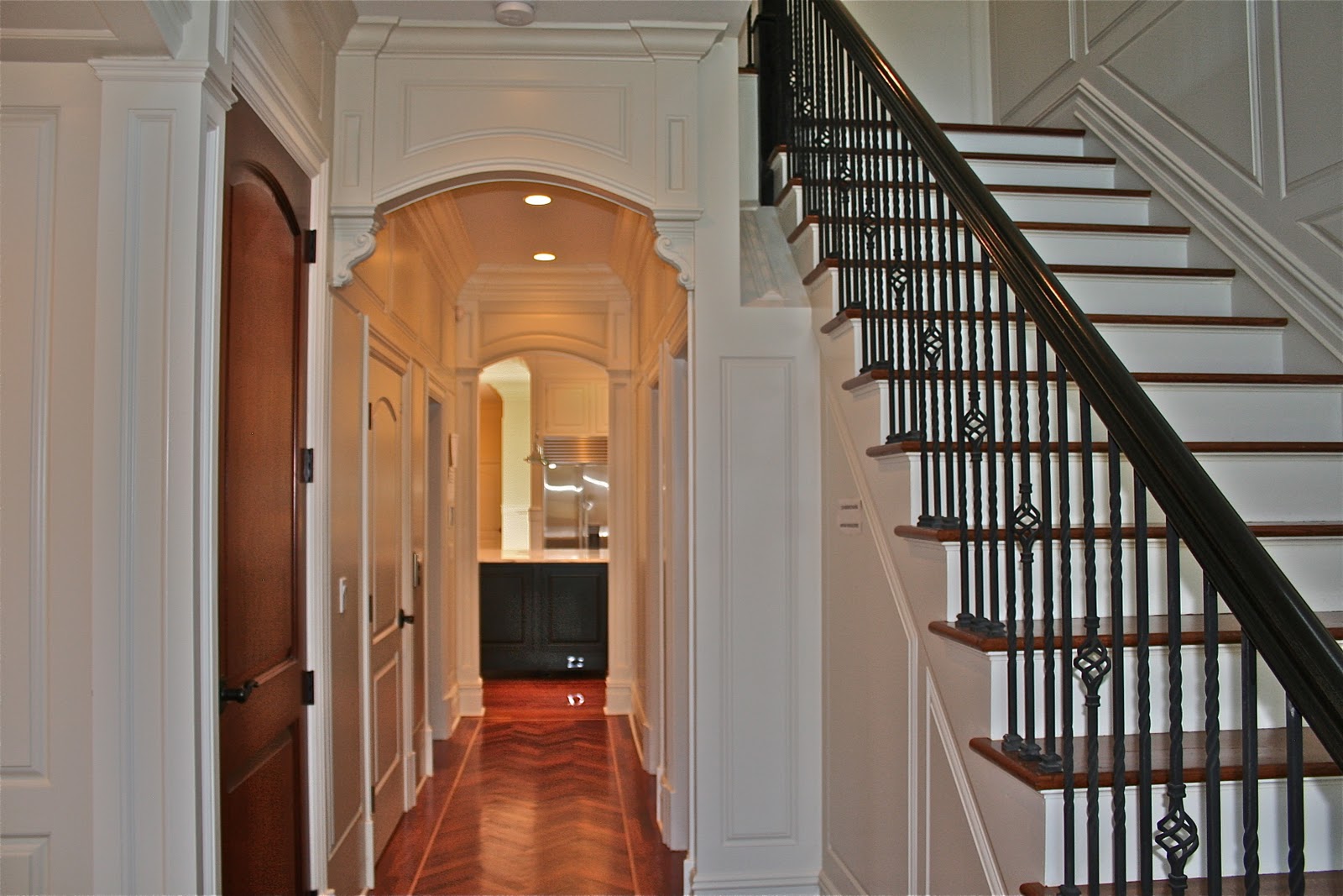
(Those mahogany floors are drop dead gorgeous!)
 |
| Wall Panels Benjamin Moore Winds Breath OC-24 Wall & Ceiling Benjamin Moore Horizon OC-53 |
From the moment you enter, you are surrounded with sophisticated workmanship and design. Cannot escape the awe.
 |
| Wall Panels Benjamin Moor Winds Breath |
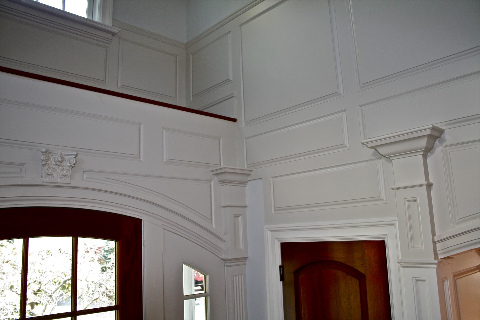
Fine woodwork and attention to detail is everywhere.
 |
| Benjamin Moore Winds Breath OC-24 |
Graceful lines, classical elements, and rich neutral colors, weave the elaborate details into one harmonious theme.

(Beware, in general, too much color can take over and make a space brood; not enough color can be wimpy, and tantalize the space.)
 |
| Ceiling Benjamin Moore Horizon OC-53 |
I love how celestial colored ceilings not only make the ceiling soar, but lift our spirit as well!
And notice how magnificent the crown moldings look when the ceiling is painted a different color from the molding.
 |
| Ceiling Benjamin Moore Horizon OC-53 |
It is interesting to note that although the walls are painted the same color as the ceiling, the color on the ceiling appears darker due to shadows. (This is typical, so if you want both to match, you must lighten the paint formula.)
But I recommend the color difference. Adds interest, and makes the design feel alive. Think about it; nothing in nature is perfect, nor stays the same. Our eye is use to seeing shadows and variances. Natural beauty. So I don't strive for artificial perfection!

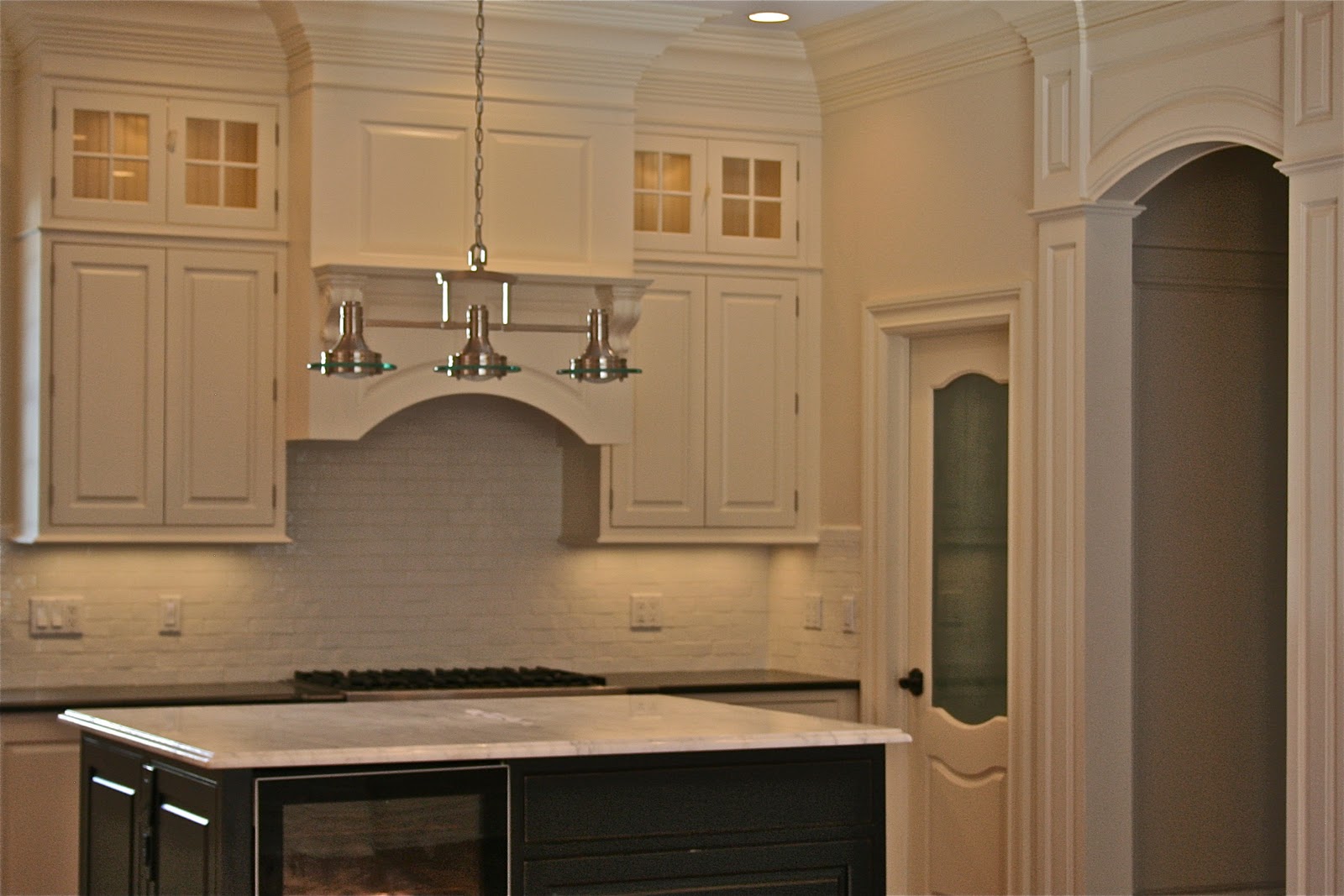
The colors on this project were chosen specifically not to overwhelm the architectural elements, but to enhance. There is enough visual stimulation in the fine detailing and woodwork.

Note: too many colors would have caused chaos. Not enough colors would have been dull.
 |
| Walls Benjamin Moore Hepplewhite Ivory HC-36 |
Color design is like writing music. All the elements of the space must work in composition with each other, to create harmony.
 |
| Walls Benjamin Moore Hepplewhite Ivory HC-36 |
Color and design must incorporate several concepts into one theme. The three most important being: beauty, function, and meaning.
A color should not only look beautiful, but echo the function of the space, and have a meaningful connection to the overall theme, as well as the client's tastes.
Because this job is a spec house, warm neutral colors were chosen to appeal to a wide range of personalities and decorating styles. Yet, these neutral colors are rich and interesting enough to intrigue on their own.

Ahh. The magic of color and design has won again. Livable elegance has been achieved.